WinWin Partners
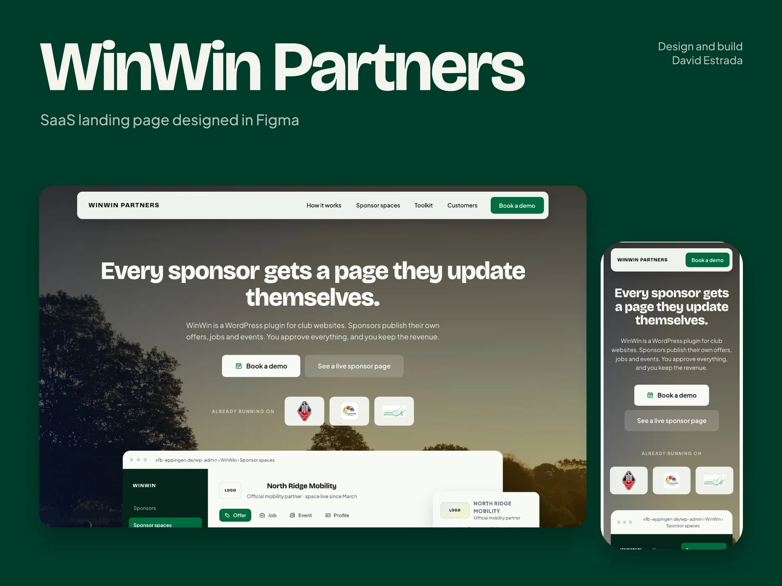
A SaaS landing page for a sports-club sponsorship platform, designed in Figma for desktop and mobile and delivered in two colour directions. Five-star review.
- Role
- Product designer and Figma web designer
- Agency or client
- Tools
- Figma
- Status
WinWin Partners
A new kind of sponsorship, explained in one page, and delivered in two colours to choose from.
- Role
- Product designer and Figma web designer
- Scope
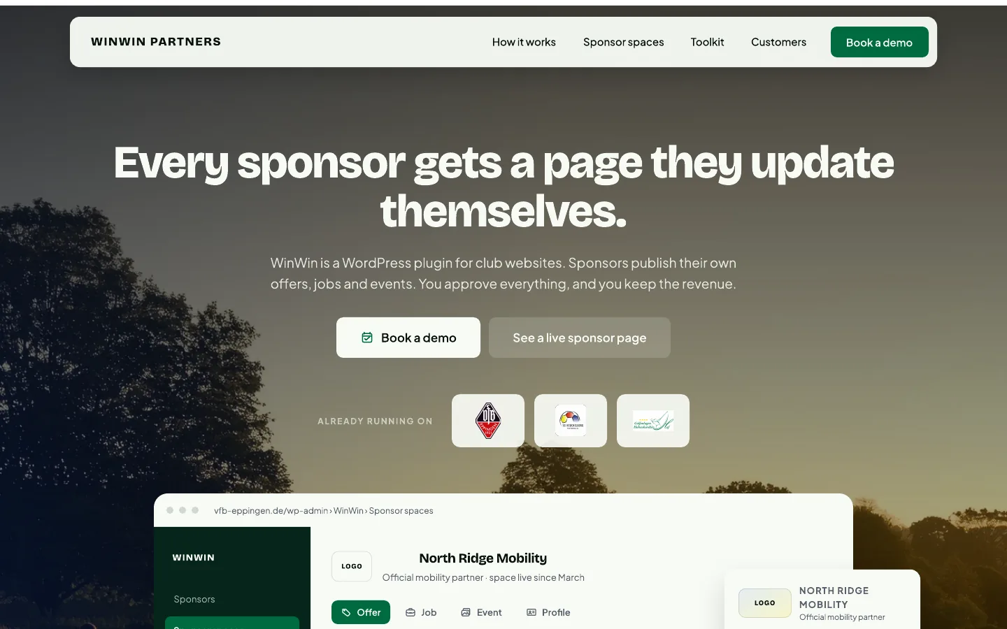
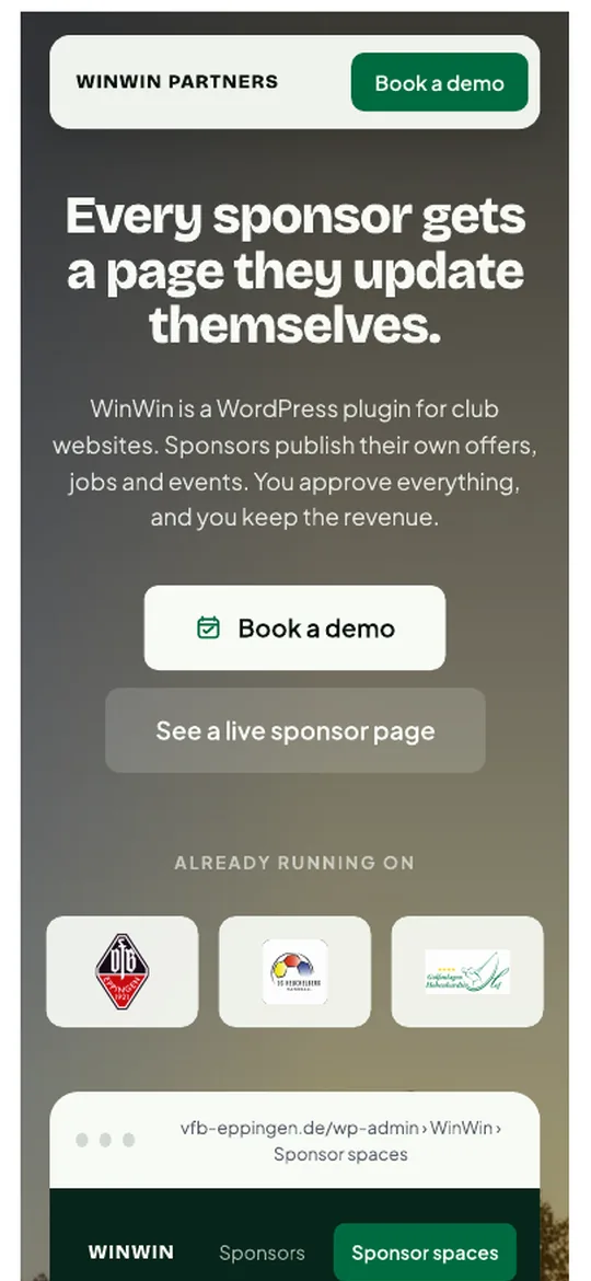
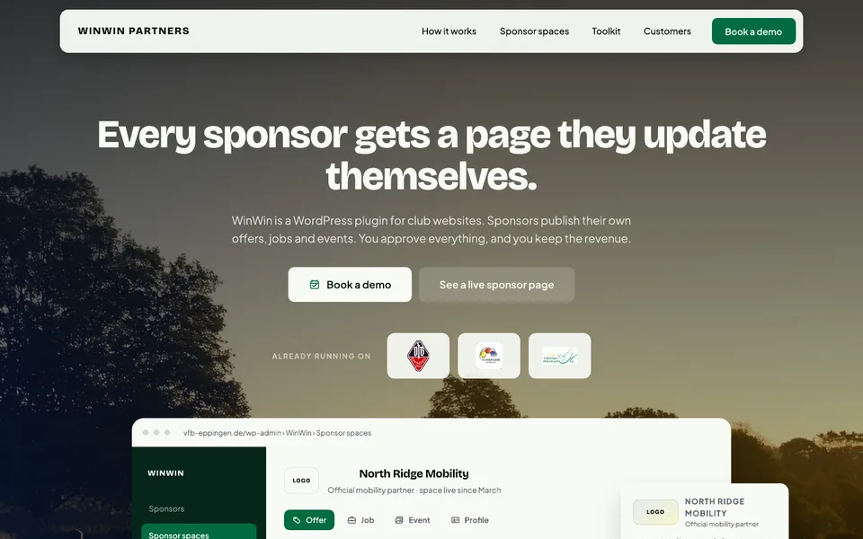
- Landing page for desktop and mobile, two colour directions
- Built with
- Figma
Project showcase
The brief, in three moves
The brief, in three moves
-
01
Explain an unfamiliar model, fast.
WinWin Partners helps sports clubs turn static sponsor logos into sponsor spaces: sponsors publish offers, jobs, news and company information, while the club stays in control and the content stays inside its own site.
-
02
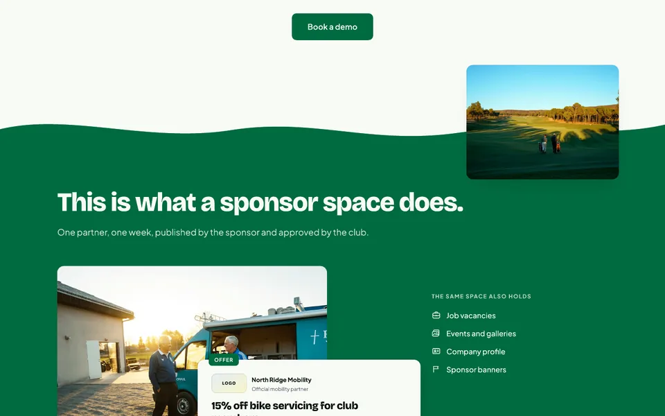
Show enough real interface to be believed.
Readable product screens, so a visitor can see what the product actually looks like, without turning into one more software page.
-
03
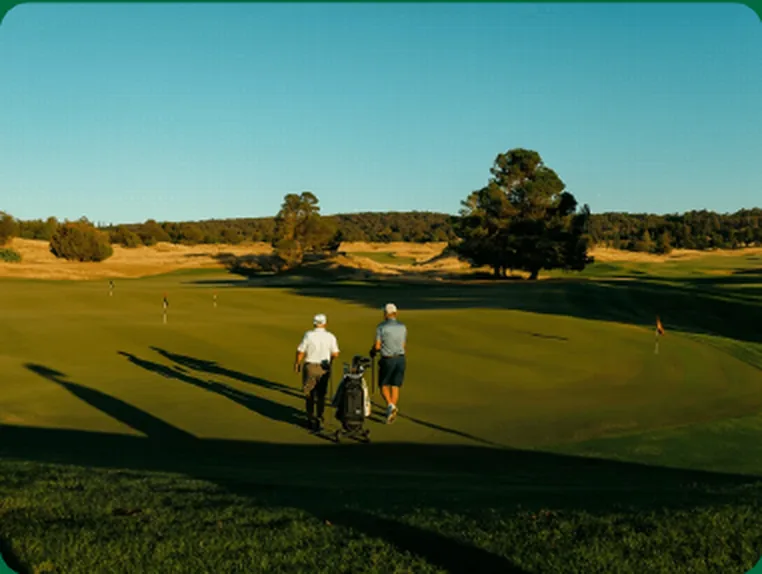
Keep the energy of local sport.
Editorial sports photography for the feeling, and complete desktop and mobile layouts in Figma, not one desktop composition with the phone left for later.
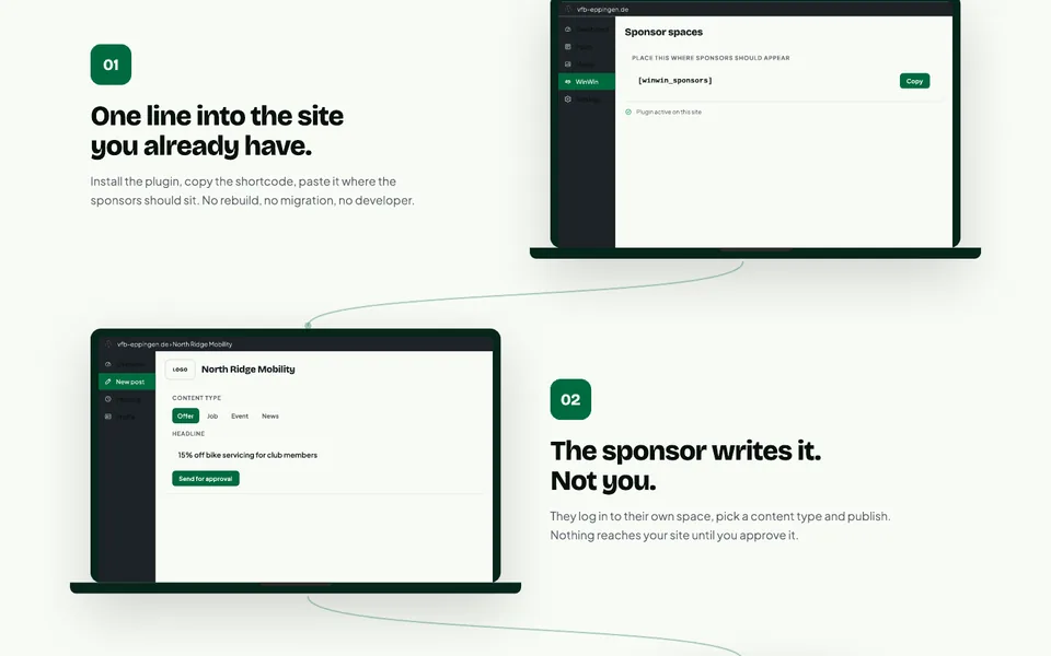
A static logo becomes an active sponsor space.
A static logo becomes an active sponsor space.
Everything on the page leads back to that one change.
What I did, piece by piece.
What I did, piece by piece.
-
The story
Built around the product’s central idea: a static logo becomes an active space.
-
Interface you can read
Real product screens beside editorial sports photography that gives the page its feeling.
-
Desktop and mobile
High-fidelity layouts for both, designed section by section.
-
A club’s questions, in order
What sponsors get, how the club keeps control, the three steps, what the product does, who trusts it, and a call to book a demo.
-
Two complete colour directions
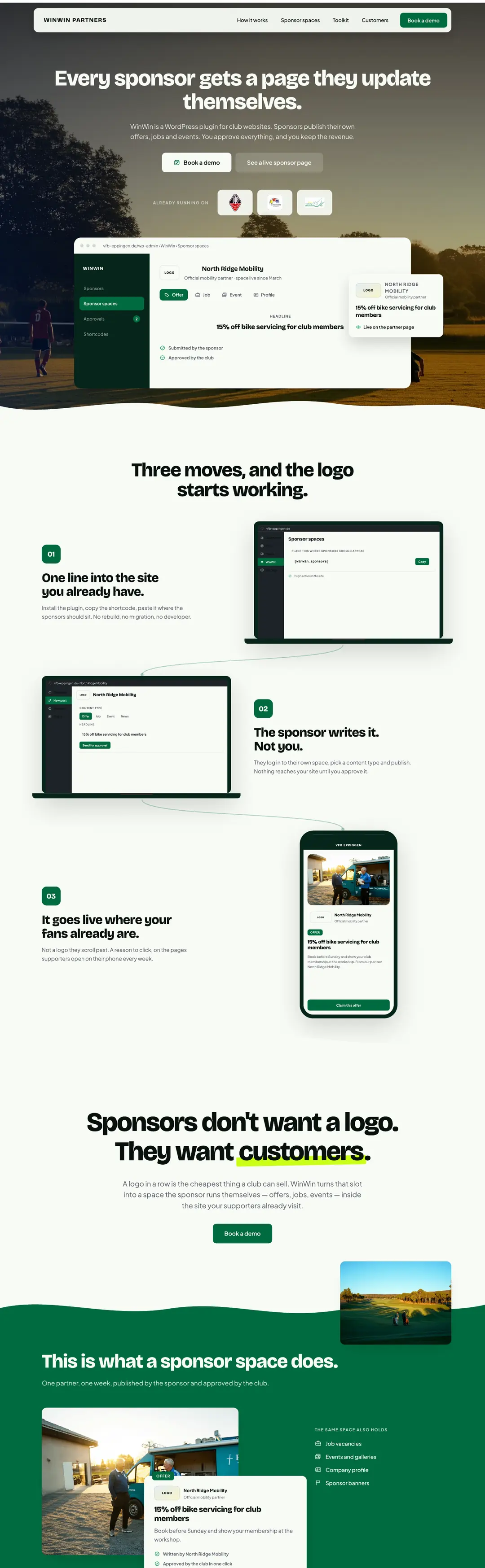
Green and purple, so the team could compare them side by side before refining the final one, instead of imagining a second option from a description.
Same page, two colours.
Same page, two colours.
The client could hold them side by side and choose, instead of imagining a second option.
 Pitch green
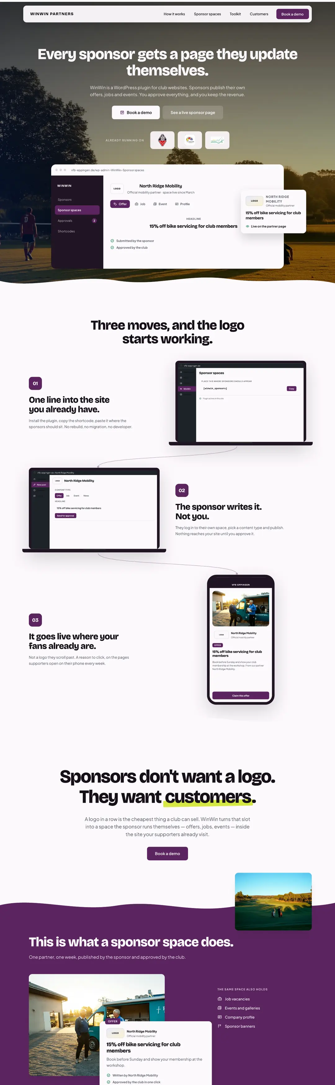 Plum