VisiBroad
A redesign and responsive rework of a WordPress landing page in Elementor Pro, keeping the brand’s identity on desktop, tablet and mobile. Five-star review.
- Role
- Web designer and Elementor developer
- Agency or client
- Tools
- WordPress, Elementor Pro
- Status
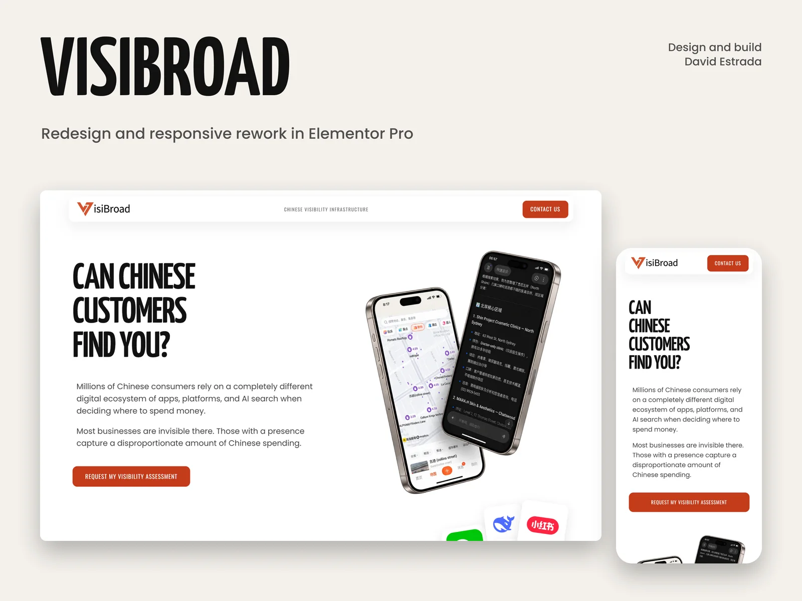
VisiBroad
The same page and the same identity, made deliberate on every screen.
A redesign and responsive rework of a WordPress landing page in Elementor Pro, for a company that helps businesses be found by Chinese customers.
- Role
- Web designer and Elementor developer
- Scope
- Redesign and responsive rework of the landing page
- Built with
- WordPress, Elementor Pro

The brief
The brief
VisiBroad helps businesses outside mainland China see and improve how they appear across Chinese platforms, maps, apps and AI search.
The brief
Project showcase
What it needed
The page already said the right things. It needed a clearer hierarchy, better spacing, more consistent details and a responsive layout that felt planned rather than squeezed onto a smaller screen.
What was not up for discussion
The work had to happen inside the existing WordPress and Elementor Pro site, not as a concept someone would rebuild later. And the black, white and burnt-orange identity people already recognised stayed. This was improving a website, not replacing it.
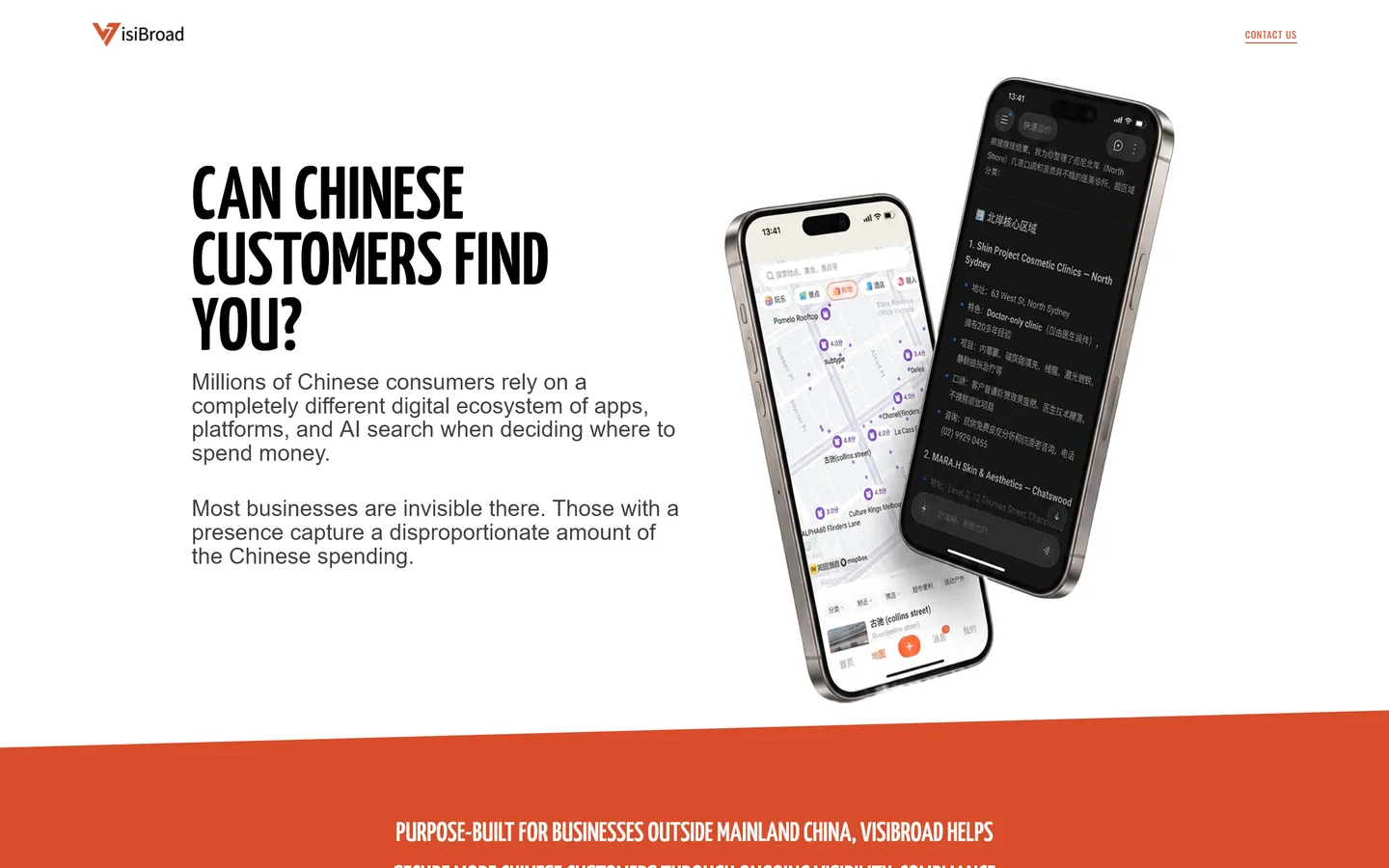
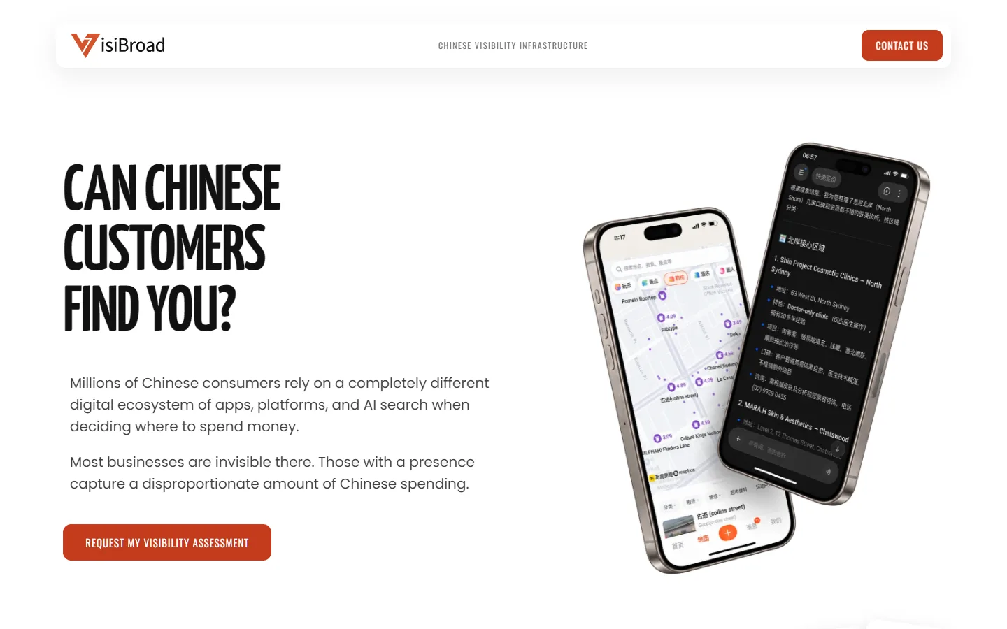
How different is the first screen?
How different is the first screen?
The same words and the same identity. Before on the left, live today on the right.
What I did
What I did
- Hierarchy
- Refined the typographic hierarchy so the main proposition and the message of each section scan faster.
- Spacing
- Reworked spacing and alignment for a steadier rhythm from the hero down to the assessment form.
- Consistency
- A better-presented logo, and the same kind of element looking the same everywhere.
- Hover states
- Buttons and links that feel finished, so it is obvious what can be clicked.
- The assessment
- A clearer assessment section and form, since that is the one action the page asks for.
- Footer
- A deliberate footer instead of an afterthought.
- Responsive
- Adapted and checked on desktop, tablet and mobile, one screen size at a time.
Every change was made inside the client’s own WordPress and Elementor Pro site.
One page, three screens
One page, three screens
The whole page at the same scale on a computer, a tablet and a phone. Nothing is dropped on the way down: it is rearranged.
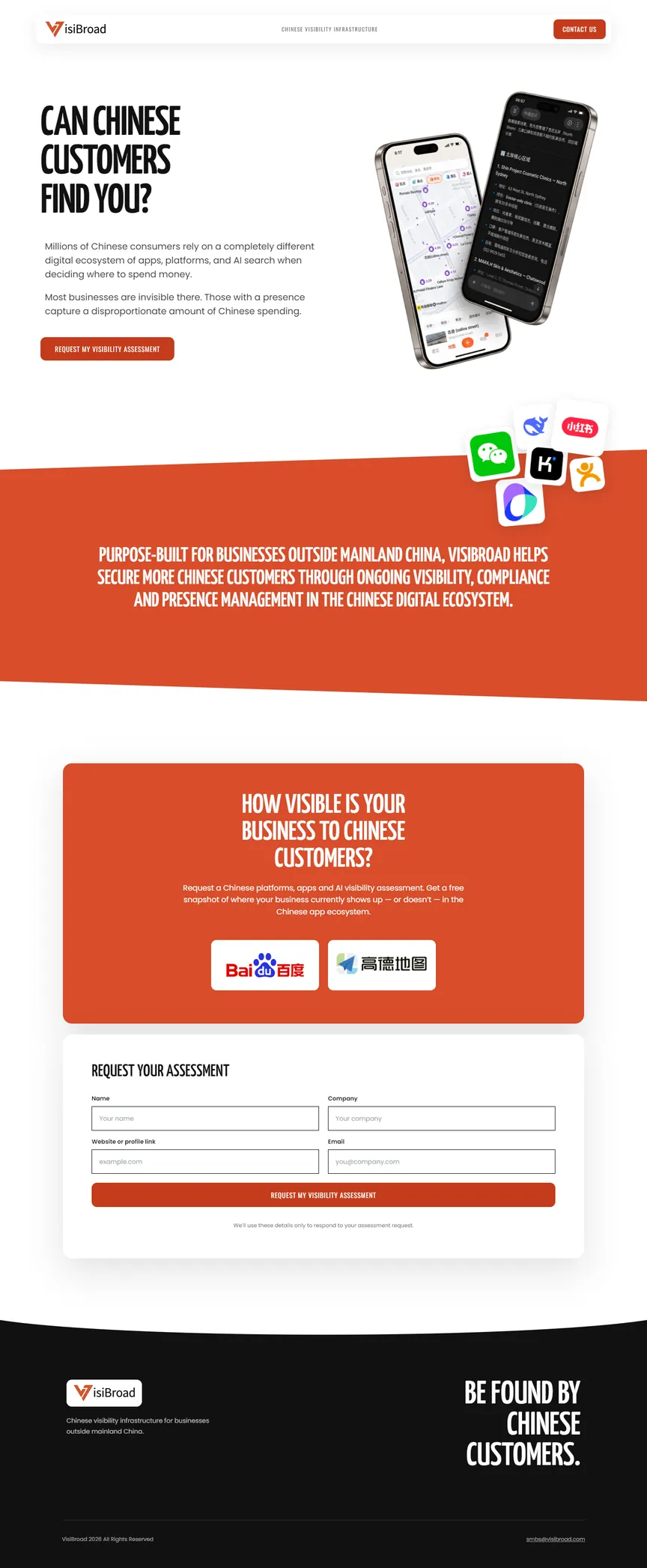 Desktop, 1440
 Tablet, 768
 Mobile, 390